 Original Cover
 My Cover
Okay so I've been in a bit of an art slump lately and as such I haven't updated on here for a while. That being said I've got a good one today. There was a "Recreate a Hellboy Cover
Contest" Over on the Darkhorse comics blog that I was told about, so I decided to enter. (the winner will be announced on July 15th) I decided on the above cover because of the action and movement, plus Hellboy fighting skeletons is always a fun thing for me to draw.
However My process for constructing this piece was a bit different than my usual process so I thought to make up for my lack of posting I'd do a process blog on how I got to the final illustration. So I'll now bore you all with a tutorial and a crazy amount of pictures chronicling how I did this from start to finish!
However My process for constructing this piece was a bit different than my usual process so I thought to make up for my lack of posting I'd do a process blog on how I got to the final illustration. So I'll now bore you all with a tutorial and a crazy amount of pictures chronicling how I did this from start to finish!

This is the thumbnail I decided to go with. More or less the same as Mignola's original design with slightly altered poses.
 I drew my preliminary sketch with blue colored pencil. This allowed me to get all my searching lines down without having to worry about erasing them when I was going back in for detail. I just recently started using this technique after resisting it for years and I now Highly recommend it.

It allows the regular pencil lines to be a lot cleaner and more thoughtfully placed since you already have the skeleton of the drawing finished on another "layer". You can then mainly think about clarifying detail and not have to worry about erasing the understructure of your drawing while simultaneously trying to clarify the details.

In short, it works well. Try it! I mainly used a mechanical pencil and an HB for the larger shading areas.

This was a very different step for me. Normally when I ink I do it either straight on the original pencil drawing or on another piece of bristol with a light box. This time though I overlayed a sheet of transparent lightly frosted Mylar/Vellum. Honestly I'm not exactly sure what the proper name is because I've heard it called many things. However I do know that whatever it's called I need more of it because I really love to ink on it! It just lets the ink move so freely and smoothly. If you can afford to get some of this stuff do it! It is kinda expensive, but worth it.

I primarily inked with a crow quill dip pen, but I used brush to fill the larger black areas. I did adjust the levels on Photoshop a bit to make it a bit more crisp.

Now we get to the coloring. I'm using Adobe Photoshop CS5 for this but most versions of photoshop can be used for this tutorial. As you can see I started with the dreaded "EVIL GRADIENT". I know it's sorta looked down on but I do use gradients and it is normally how I start a piece. I do this because it makes it easier to create a color palette for a piece. It's harder to go out of your palette if the base color(s) are staring you in the face the whole time you're making a piece. As long as it's obscured by the time you reach a finish it's a good tool.
I should also mention that if you are unaware of how to separate your line drawing onto a separate layer in Photoshop and color under it there are a few ways and many tutorials online. This tutorial demonstrates the process which I use.
I should also mention that if you are unaware of how to separate your line drawing onto a separate layer in Photoshop and color under it there are a few ways and many tutorials online. This tutorial demonstrates the process which I use.

Next I went in and laid down some flat colors for the figures and the rocks. I just used a normal "hard round" brush at 100% opacity for this. I should also note that these colors are being applied on a new layer, called "flats", which I place under linework layer but above my gradient layer.


Then I went in and created another layer between my "flats" layer and the gradient layer to add some texture. I used some custom brushes for this.
 I then used a new coloring technique I found on this youtube video demonstrating a simple way to add highlights and shadows using the lasso tool and a normal airbrush at 30% opacity. Although I'm sure you could experiment with other brushes. I recommend watching this video if your piece often starts getting overworked at this point like mine tended to. I often had trouble knowing when to stop adding highlights and shadows, and the image became muddled and I'd have to spend hours to make it look right. But, the video linked above splits it into a process of steps that is much more efficient and in the end yields better results in half the time.
 I then used a new coloring technique I found on this youtube video demonstrating a simple way to add highlights and shadows using the lasso tool and a normal airbrush at 30% opacity. Although I'm sure you could experiment with other brushes. I recommend watching this video if your piece often starts getting overworked at this point like mine tended to. I often had trouble knowing when to stop adding highlights and shadows, and the image became muddled and I'd have to spend hours to make it look right. But, the video linked above splits it into a process of steps that is much more efficient and in the end yields better results in half the time.
...I apologize if I began to sound like an infomercial for a second there.


Next I added some clouds and slight mist using custom brushes.

Finally I added a dark rust and phthalo blue gradient on a new overlay layer ( about 60% layer opacity) to add a bit more vibrancy to the color, and also unify the colors just a bit more. This layer was placed on top of all my other layers so that it would effect all of them. This is similar to the effect you'd get by glazing a painting.
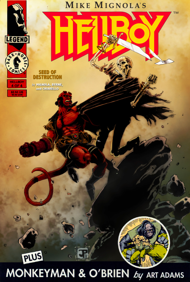
Then I more or less lifted the typography off of the original cover including the bottom banner. I'm really happy with this and feel like I've made a few jumps in skill level with this piece. So even if I don't win the contest I at least have a new illustration I'm proud of.
If somehow I missed something in this tutorial leave me a question in the comments and I'll do my best to answer it.
Also, Hellboy and all related characters are © of Mike Mignola.
If somehow I missed something in this tutorial leave me a question in the comments and I'll do my best to answer it.
Also, Hellboy and all related characters are © of Mike Mignola.
dude this is so awesome! thanks for posting you're process, the blue pencil technique is definitely something I need to look into (I'm sick of piling up sheets of tracing paper every time i want to fix my sketch). This is definitely a break-through piece for you. This new technique you're trying is working really well with your style . Also, I've been in an artistic slump as well and this is serving as a great piece of inspiration for me. Win or lose the contest, you have every right to be proud of yourself. Once again, this is so awesome. congrats!
ReplyDeleteThanks a lot man! I'm glad I could inspire you a bit! Definitely try the blue pencil it does wonders!
ReplyDeleteSeriously one of the best things I've seen you do. Love this piece dude.
ReplyDeleteThanks man! :)
ReplyDeleteJason, this is truly one of your best works, amazing job!
ReplyDeleteAMAZING. I think you should do a tutorial for every post that you do. It really is great. As for your new techniques, you should always do them because they are AWESOME!
ReplyDeleteJason, what the hell dude why are you so much better than me? Do you think you'll try working this way more often now? Its looking good, that tutorial must've really helped.
ReplyDelete